Led end-to-end UX across a 7-product golf ecosystem: hardware, software, and the design system connecting them.
From 2024 to 2026, I led product design at Blue Tees Golf, building the team while unifying seven products through a shared design system and closer collaboration with product and engineering.
The result was one visual language across apps and devices, anchored by a 590+ component library shared by the Rainmaker iPad app and device screen. I led the app from first flow to its June 2026 App Store launch, with the product, system and team growing together.
Seven products, designed in isolation
Blue Tees Golf was scaling from a single rangefinder into a full connected ecosystem, launch monitor, GPS speaker, watch, handheld, and mobile app. But each product was being designed in isolation. There was no shared interaction language, no cross-device UX consistency, and no unified data model tying shot tracking across hardware and software.
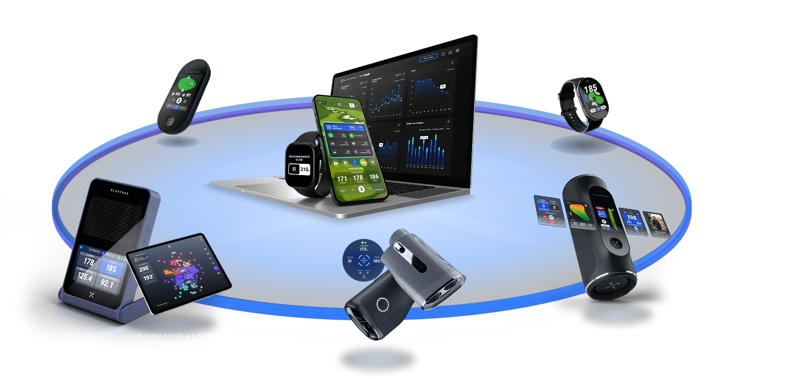
Defined the UX strategy that turned seven standalone products into a connected ecosystem. Every screen, flow, and interaction across the lineup traces back to a single design system and a shared information architecture. So a golfer moving between the watch, the speaker, and the app never has to re-learn the interface. This wasn't inherited; it was built from scratch, working directly with the founder to align product, engineering, and brand around one coherent experience standard.
Three rules I held to.
- Show lessThe question was never which metrics to show. It was how few.
- Readable from the mat, in the sunType sized focused on metrics. Solid shapes, white on black, so nothing disappears in the sun.
- One role, two screensA tile asks for a role, like card surface. Each screen answers with its own value.
One design system for every screen
The device's own screen has no text rendering and can only animate brightness. Every word on it is an image, in five languages. The iPad app has glass, motion and a 3D scene. Both had to feel like one product.
- Audit scope127
- Bluesbefore
7→, after 1 plus shades - Type sizesbefore
30→, after 15 - Coloursbefore
24→, after 13 - Button setsbefore
12→, after 6 - Library590+
I audited every product first: 127 colours across nine palettes. The Game app went from 30 type sizes to 15 and from 24 colours to 13. Seven blues became one, #1444EC, plus its shades, shared by the app chips and the device states. Twelve button sets became six. The type scale moved onto 4 px steps, each size used by a real component. A tile now asks for a role, like card surface, and each screen answers with its own value, so the look can change without touching how anything works. At the My Bag handoff, 72% of the duplicate components went away.
One tile, two screens
Standard screens
Custom-sized screens
Session screenorganisms laid out with real datasurface/
Screens
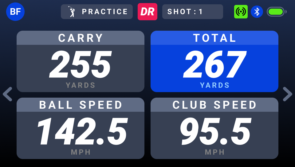
Practice dashboardorganisms laid out with real datamain_
Metric tile gridmolecules grouped into one regionradius/
Organisms
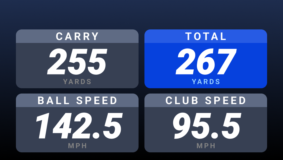
Readout gridmolecules grouped into one regionLevel 4 · #5F6B84
TOTAL tileatoms joined to do one jobstatus/
Molecules


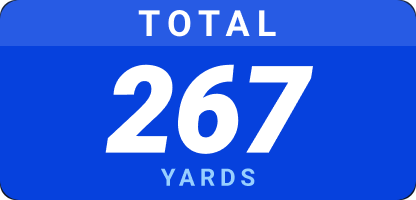

Readout, status bar, labelatoms joined to do one jobHighlight - 2 · #275BE4
Label, value, chip, toggle, tagthe smallest parts, built from tokenstext/
Atoms




Icon, badge, chip, glyphsthe smallest parts, built from tokensLevel 3 · #3C465F
Colour, type, space, radiusnamed values, no interface yetblue/
Sub-atomic (Tokens)
Colour, type ramp, grid, radiusnamed values, no interface yetHighlight - 1 · #0641DD
If you can't read it in the sun, it isn't finished
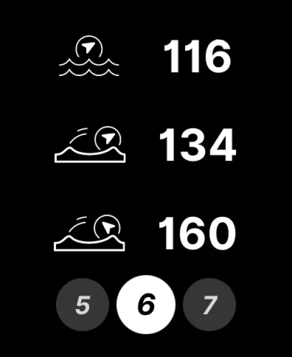
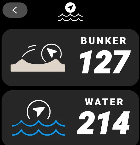
Testing screens outside started on Playmaker+, our first watch. On different days, the thin outline icons disappeared in the sun. I moved them to solid shapes, white on black, and it became the rule on every product.
 12
- 1Contrast under glareIcon lines on black: WCAG 1.4.11, 3 : 1
- 2Hairline strokesAbout 3 px lines, the first the glare takesLegibility: stroke weight
Every icon, redrawn solid
We pulled the icons off the app and watch screens into one audit and sorted them into stroke and solid. Many symbols had been drawn both ways. The stroke versions were the ones that disappeared in the sun tests, so solid became the rule across products.


Every word is an image, in five languages
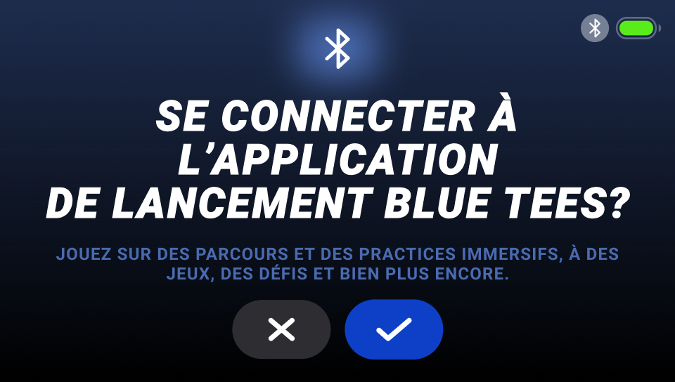
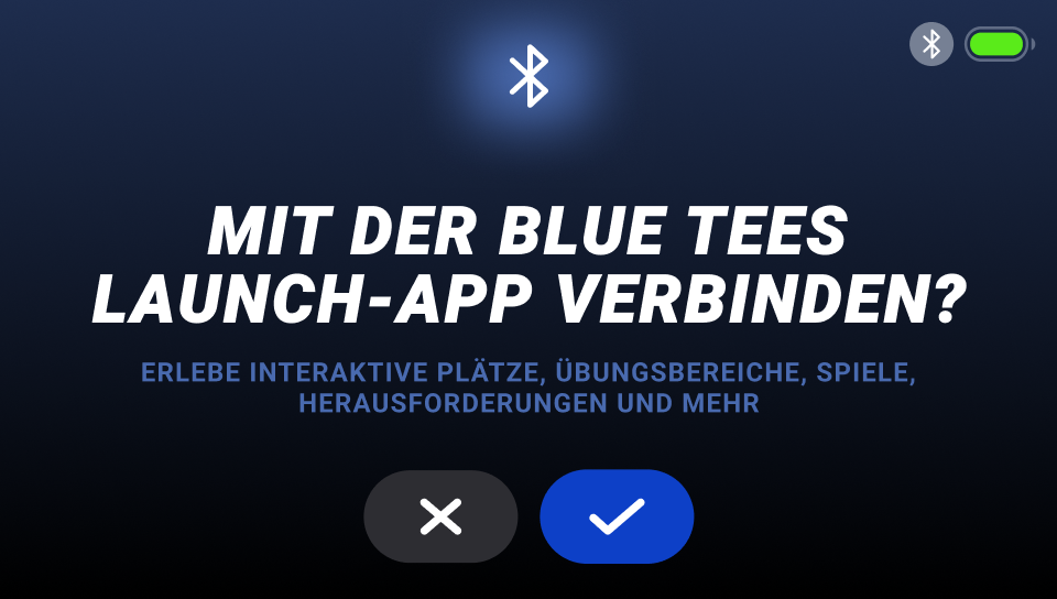
Each label is an image in a fixed slot. Pick a language and both screens change, the device screen and the Launch App prompt. Each blue box is sized to the longest label in that slot across the five languages (the dashed line is the real slot); the pink marks the room the chosen word leaves inside the box.
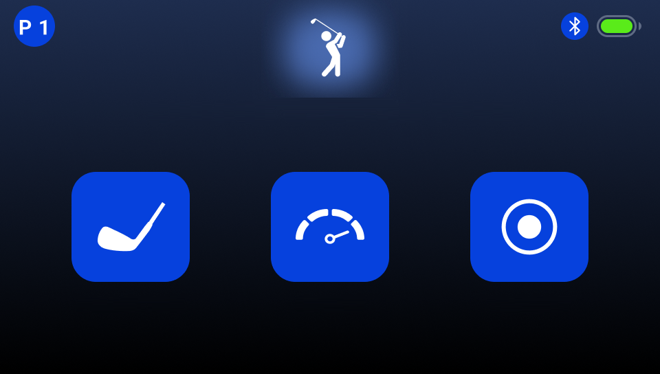




















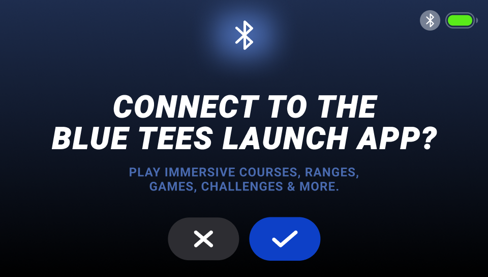
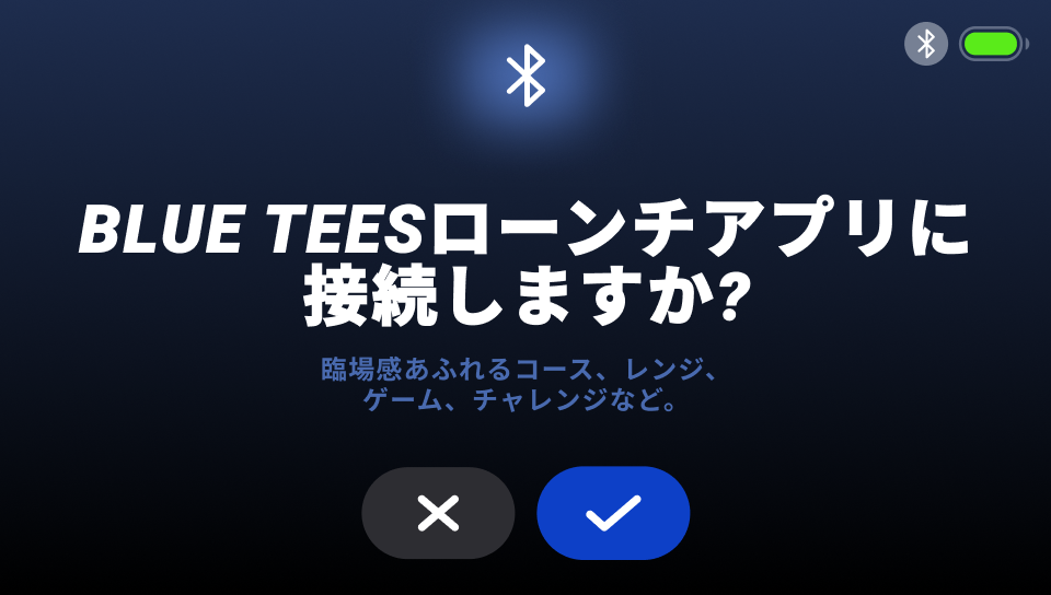
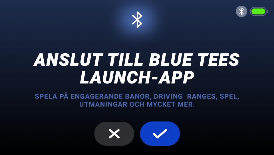
English sits inside every box. TARGET has the least room, 6 px each side.
ENTRAÎNEMENT is the longest Practice label, so it sets that box and leaves nothing. The title leaves 8 px each side.
German sets two boxes: the title, and GESCHWINDIGKEIT in Speed. Both leave nothing.
ターゲット is the longest Target label, so it sets that box. 練習 is the shortest Practice label and leaves 45 to 46 px each side.
Swedish stays well inside every box, from 19 px in Target to 66 px in the title.
French runs to three title lines, so the text block sits higher than in the other four.
German still fits in two title lines.
Japanese mixes the Latin brand name with kana on one line.
Swedish fits the English layout, two lines and two lines.
Coaching a physical task with a screen
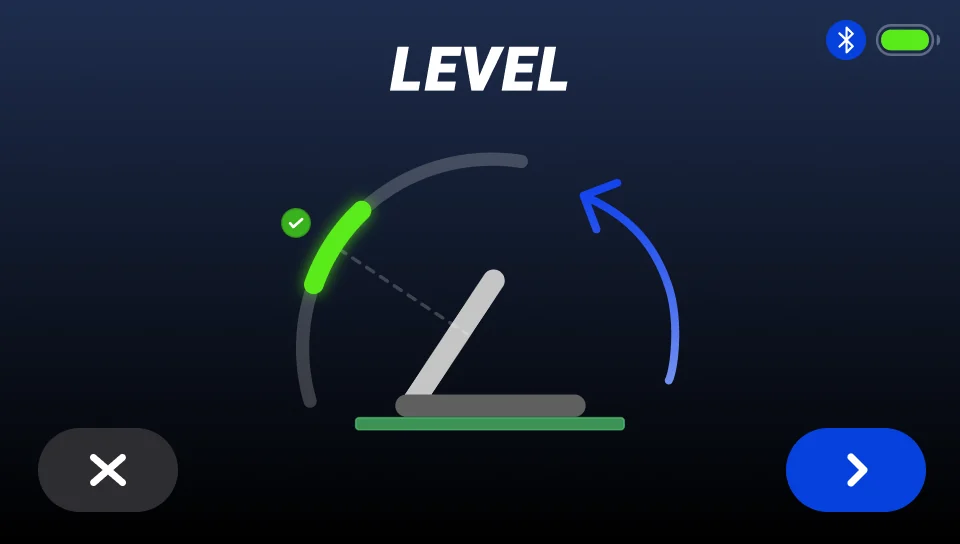
Before a session, the device has to sit at the right tilt, about 5 ft from the ball and level with it. Its screen has no text to explain that, so a side view does: an arc that turns from red to yellow to green as the tilt comes into range, and an arrow for the way to move it. Two more screens set the distance and the height. I tested it outside in direct sun, from five feet and from one.
The calls that shaped the app
The lead story · Rainmaker app, iPad and iPhone23+ metrics, customized for each level of golfer
Rainmaker measures 23 things about a shot. Coaches teach that a golfer can work on about six at a time, and the iPad stands about five feet away on a range mat. So the question was never which metrics to show. It was how few.
I built the screen from tiles, in layouts of 1, 2, 4, 8 or 16, with any metric in any tile, and sized the type for the distance, not for the grid. Try it. Step back to the mat and see what you can still read.
Numbers are about 17 px tall at the screen.
Working prototype: click to interact. On the iPad, tap the layout pills above the tiles and the clubs on the right.
The user can also customize which metric they want. This enables them to focus on improving their specific gaps, such as:
- Club Path and Face Angle
- Smash Factor (Ball Speed divided by Club Speed)
- Spin Rate and Launch Angle
- Carry Distance
"App is really intuitive and easy to use. Does a great job at keeping you focused during practice. Refreshing to see a launch monitor app that doesn't try to do everything at once!"
A whole session on one map
After fifty shots, a list of numbers tells you nothing. The dispersion view puts every shot of a session on one map, so the pattern shows.
In the final design each club family got one hue and each club a shade of it, so you read the family first, then the club.
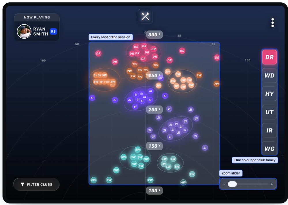
Marketing and sales used the dispersion view at events and shows, including the PGA Show.
The trend sits where you're already looking
In Target mode you pick a distance and try to land on it. To improve you need your trend, but a trend usually means a chart, and a chart means another screen while your hands are on a club.
I borrowed onion skinning from animation: your last five shots stay on the range and fade, the newest brightest. Setting the target is one swipe, and the rest of the interface blurs while you do it.
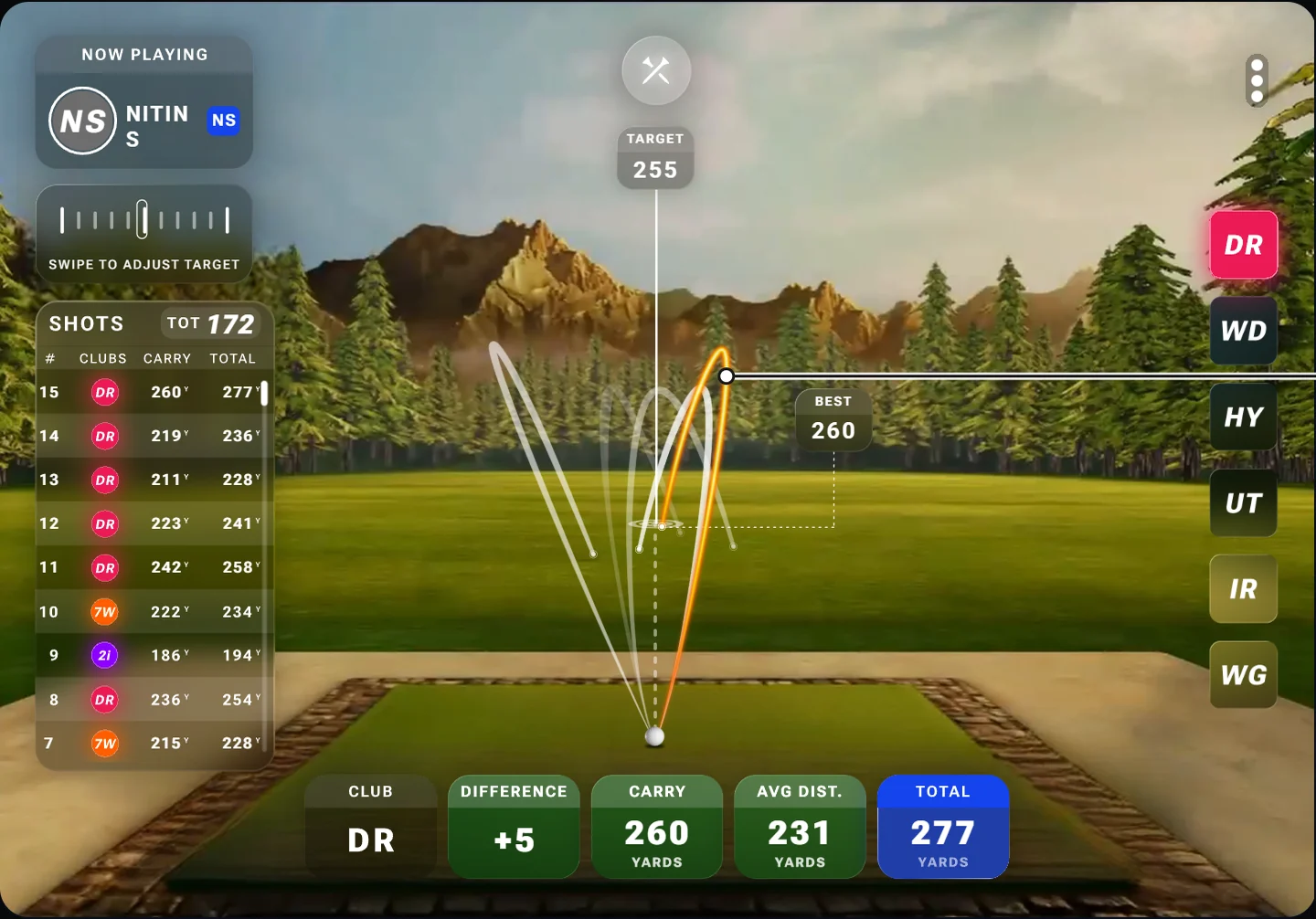
- One swipe sets the distance
- Last shots, fading
A file framework, so engineers stopped asking which version was right
How the team's Figma files went from loose frames to one template, and what that changed at handoff.
A team, and files people could find
I joined as the first product designer in the US and grew the design team from one to four, across the US and India. Our Figma had no covers or flows, and decisions were made out loud. In my first week I shipped a file framework: a cover with status and version on every file, and pages split by phase and platform.
Soon the PMs and the designers were writing their decisions into the file. Every handoff came with a changelog card on the page, with the old and new design side by side, so engineers stopped asking which version was right. The hardware partner's team was new to Figma, so they got tutorials first, then wireflows for every press of the remote.
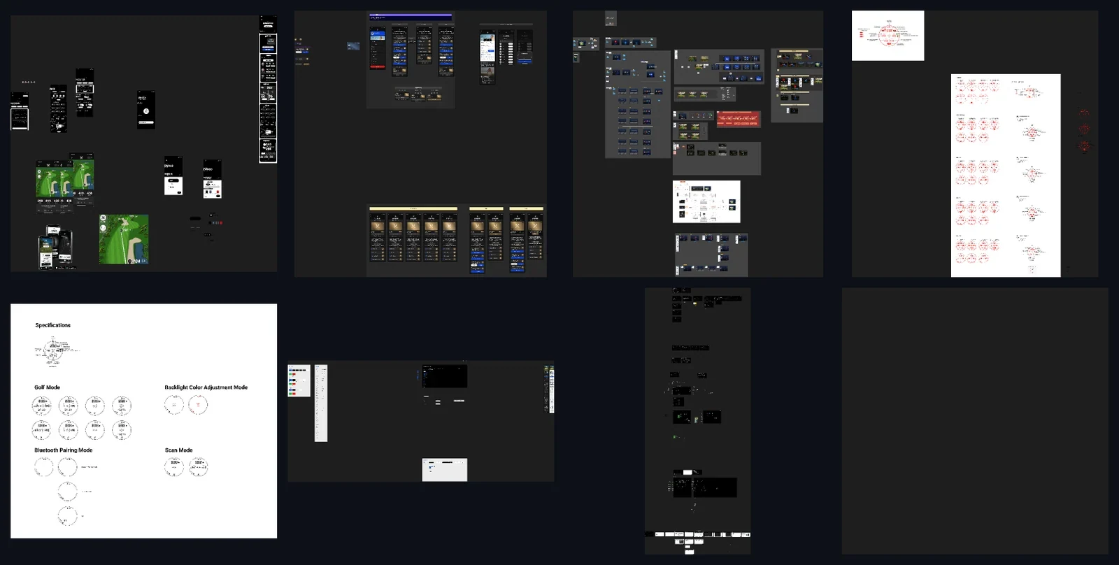
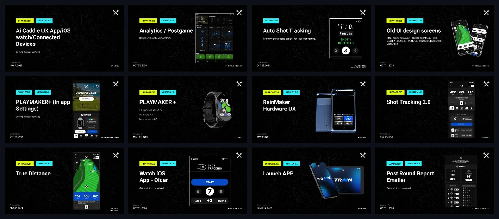
One template every file started from
The founder and I wrote the framework down as a template every file started from: a cover with status and version, then the pages in one order. Every page name carried its date, what it was, and a status colour.
- Rainmaker Cover
- Overview
- \-----Dev Handoff </>
- ↳ 03.11.25 Primary \ Flow \ First Time Setup 🟢
- ↳ 03.26.25 Primary \ Flow \ Home 🟢
- ↳ 04.03.25 Primary \ Flow \ Session Summary 🟢
- ↳ 04.22.25 Primary \ Flow \ Range 🟢
- ↳ 05.07.25 Secondary \ Flow \ Hero Screens 🟢
- ↳ 05.15.25 Primary \ Component \ Design System 🟢
- ↳ 05.21.25 Tertiary \ Flow \ Team Workflow 🟢
- ↳ 05.29.25 Primary \ Flow \ My Bag 🟢
- ↳ 06.10.25 Primary \ Flow \ Session History 🟠
- ↳ 06.13.25 Secondary \ Flow \ Settings for Profile 🟠
- ↳ 06.18.25 Secondary \ Flow \ Demo Mode 🟠
- ↳ 06.23.25 Tertiary \ Flow \ Mobile Wireframes 🔴
- UI Library
- Wireframes - MVP
- WIP - Range UI
- For Review
- \-----Research 📖
- \-----Draft/Archive 🗂️
- Archived Designs
- --- Simulation (Phase 2 or beyond)
- Sandbox
↳ [Date] [Class \ Type \ Verb] [Status]
A Dev Handoff page in this file
↳ 04.22.25 Primary \ Flow \ Range 🟢
What I'd do differently
- Test outside the building
Our testers were good golfers who worked at Blue Tees. None saw the app the way a beginner would, and the My Bag reviews show what that cost. I'd fund a small research practice before the next launch.
- Write the limits down on day one
No text on the device, heavy blur on Android, glass without motion. I found them one at a time, and each changed a design after it was drawn.
- Argue harder for the default
Sixteen tiles shipped as the default because the number sold. The first review that praised the app praised it for not doing everything at once.
Nobody buys a launch monitor to look at an app. Most of my job was getting the screen out of the way of the swing.